DRUSZY
Sweet Tooth
AUDIENCE
DRUSZY's audience is primarily composed of younger listeners--teens and young adults who are in tune with various punk subcultures and value independent music production. They revel in individual freedom and anti-consumerism, appreciative of the raw and natural aesthetic that DRUSZY brings with their music.
PROJECT GOALS
The initial goal of the project was to allow passerby and non-listeners to be able to recognize DRUSZY as an alternative band of bass guitars, blunt lyrics and unfiltered energy without needing to press play.
Through the use of intense color contrast, a custom logo of sharp lines and typography that gives off a punk feel, I was able to complete the goal of presenting DRUSZY as an band of bold music using visual imagery alone.
OVERVIEW
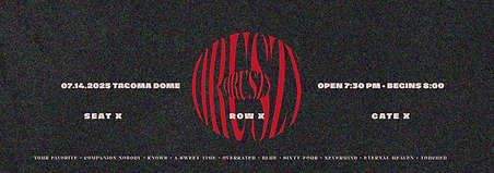
This project is a branding concept for the American punk band DRUSZY as they tour the United States on their SWEET TOOTH album.
BRANDING
DRUSZY Logos
Typography

ABCDEFGHIJKLMNOPRSTUVWXYZ abcdefghijklmnopqrstuvwxyz !@#$%^&*()_+{}|?/>.<
Stacked
5 GRAMS OF MICROPLASTICS IN A WEEK
NOLEX
ABCDEFGHIJKLMNOPRSTUVWXYZ abcdefghijklmnopqrstuvwxyz !@#$%^&*()_+{}|?/>.<
Colors
DRUSZY

#B9152b
#180501
#DDB650
#97897E
#E2D8CF
Wide
Variations


Icon Only

DRUSZY
Sweet Tooth Album Logos
Main Logo

Logo variations


Sweet Tooth
wordmark
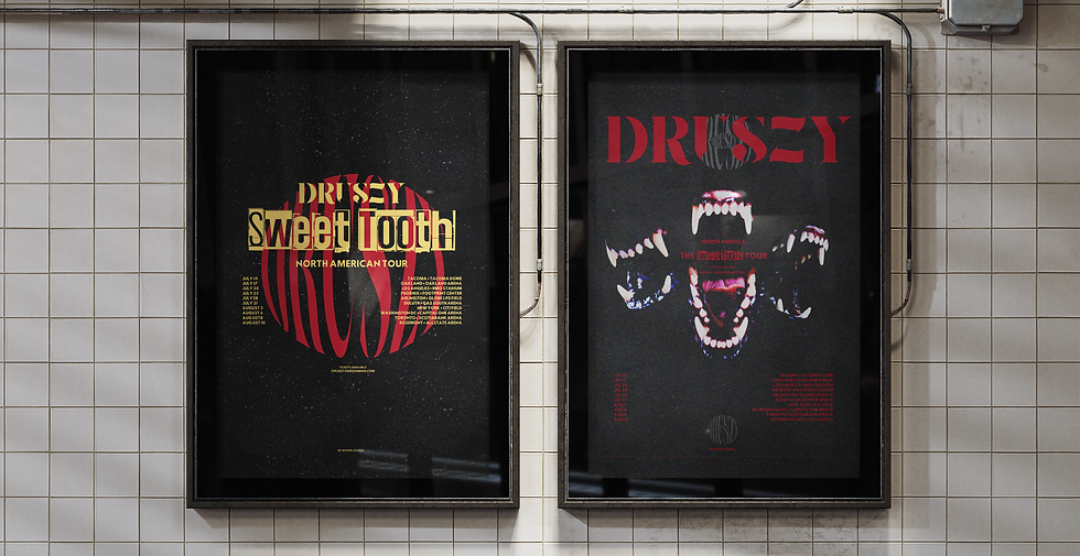
Early stages of the project contained the 'jaw' or 'teeth' illustration, which remained the visual identifier for their SWEET TOOTH album. However, the use of soft color contrast in the beginning failed in making the album cover appear as bold as intended. The use of a small-sized logo in a serif font also gave the initial cover a look that did not have much personality.
To fix this, I applied bright reds, yellows and harsh blacks, and to promote a cartoonish appearance, strayed from any realistic coloring. The use of Juha Korhonen's font, "5 grams of microplastics in a week", was especially useful in showcasing the more grungy side of DRUSZY in variations of the album logo. I used NOLEX by Maiko Hatta in the main DRUSZY logo, as its unique characteristics and glyphs added a crisp, and sharp look to the band's visual design.

VERSION 1
REVISION 1

VERSION 2
REVISION 2

FINAL
Mockups & Displays


One of the things that led me to adjust the original design was noticing the excess negative space it held, a property of minimalist designs, which was the main thing causing it to appear soft on the eyes.
The original design featured the center illustration above, on simple yellow background with an unedited font in the center. This design did not harbor significant flaws on its own, however, if to be used as an image to represent a punk band, it would need some refining.
I first chose to make use of the features Adobe Illustrator provides that makes this process much simpler. The program enables reformatting text into various shapes, and this allowed me to turn what would otherwise look like
into , or the graphic logo's current appearance, which is more elliptical. Duplicating layers and using clipping masks, I was able to imitate the look of using layer modes while having full control over the colors displayed. This helped me take up the negative space on the inside of the jaws.
The look of the elliptical logo inspired me, so I used a circular version and placed that behind the illustration. Doing this allowed me to occupy the excess space outside without dragging attention away from the center image.


CD/VINYL MOCKUPS & DIGITAL LAYOUTS
Utilized a professional mockup template to showcase custom vinyl record & CD designs. Focused on layout composition and visual hierarchy to bring attention to crucial aspects of the layout. Edited and then customized the template in Adobe Photoshop using smart objects and layer adjustments to create a realistic, high-quality presentation.


Marketing Material
CONCERT ADVERTISING


BACK TICKETS

- 1 -

- 3 -

- 2 -

- 4 -
FRONT TICKETS
- 1 -

- 2 -


